Feedback:
My tutor (Tom):
The design of the lens holder is good but the specific design of both basket and cap should be pushed a bit further. Make the design even more interesting and useful.
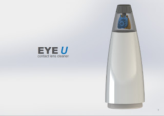
The form of the pump housing should be designed in a way that it gives the first good impression which tells the user to pump the body downwards. Such indication of "pump me!" should be strengthened.
For the posters, poster 3 and 4 can be formed as a hybrid poster. For poster 1, add some sort of context into it, maybe adding a contact lens beside the product to show the correct scale interpretation of it. Dedicate one A3 poster for the 'how to use' topic.
Classmates:
Pamela Ablang: To indicate the pumping movement of the body, add some sort of graphics or embossed pattern/ribs on the body surface. Change the shape if possible. At the moment, the product is a bit confusing because some users might use their palm to pump/press the LDPE body upwards and some would pump the HDPE housing downwards. Also, use a different colour for the LDPE bottle for better contrast. The brand name of the product can be improved. A logo would be a great addition.
Rowena Goodall: The amount of text on the poster needs to be minimised. The heroshot can be improved by showing a correct scale interpretation of the product. Show bigger and clearer view of how the pumping mechanism works and how the product looks like when it is dispensing.
Other Tutor:
Scott: 2D views of the product can be shown on posters if the 3D part of the product cannot be seen clearly enough for better communication and understanding. If appearance model is not looking as good as it is on the posters, then put the focus more on the posters and make sure that they communicate the ideas well to the readers.
My Reflection:
I might need to redesign the shape of the pump housing for better indication of the proper usage. I also need to play around with the design of the lens holder. Multiple concepts of labels should be prepared and tested out by the end of this week. Layout of the posters should be improved and rationale of the product should be ready by next week.


No comments:
Post a Comment