Monday 26 August 2013

Product disassembly - Breville Blender BFP 650


I find that the whole process of disassembling the food processor meaningful and quite challenging. It was a challenge to find the right type of head, length and width of the screwdriver to remove the screws in order to get access to the motor. Many types of screwdrivers were required to disassemble the whole product. There are too many different sizes of screws and washers used to keep all the parts in place. Also, a power drill is required to widen up some of the holes and gaps for unscrewing the screws which is troublesome.

To ensure products that are easy to take apart quickly, number and variety of fasteners should be minimised. Multiple parts could be held with only one fastener. Same type of fasteners should be used instead of multiple types. Number of parts should be minimised and simplified, and should require only a few standard/common tools to disassemble the product. Glues should also be avoided. 
To design for recycling, glass should be used to replace SAN as the material is 100% recyclable, more hygienic and does not stain easily. Total weight of the product should be decreased if possible to minimise number of parts to be recycle or to increase the life span of the product. Combination of materials that are difficult to separate should be avoided and toxic/hazardous materials should be made easy to separate them.
Besides that, all parts should be labelled properly for easier identification.


Monday 19 August 2013

Accessible Packaging Weekly Feedback - Week 4


Feedback:
My tutor (Tom): 
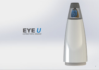
The design of the lens holder is good but the specific design of both basket and cap should be pushed a bit further. Make the design even more interesting and useful. 
The form of the pump housing should be designed in a way that it gives the first good impression which tells the user to pump the body downwards. Such indication of  "pump me!" should be strengthened.
For the posters, poster 3 and 4 can be formed as a hybrid poster. For poster 1, add some sort of context into it, maybe adding a contact lens beside the product to show the correct scale interpretation of it. Dedicate one A3 poster for the 'how to use' topic.   

Classmates:
Pamela Ablang: To indicate the pumping movement of the body, add some sort of graphics or embossed pattern/ribs on the body surface. Change the shape if possible. At the moment, the product is a bit confusing because some users might use their palm to pump/press the LDPE body upwards and some would pump the HDPE housing downwards. Also, use a different colour for the LDPE bottle for better contrast. The brand name of the product can be improved. A logo would be a great addition.

Rowena Goodall: The amount of text on the poster needs to be minimised.  The heroshot can be improved by showing a correct scale interpretation of the product. Show bigger and clearer view of how the pumping mechanism works and how the product looks like when it is dispensing.

Other Tutor:
Scott: 2D views of the product can be shown on posters if the 3D part of the product cannot be seen clearly enough for better communication and understanding. If appearance model is not looking as good as it is on the posters, then put the focus more on the posters and make sure that they communicate the ideas well to the readers.

My Reflection:
I might need to redesign the shape of the pump housing for better indication of the proper usage. I also need to play around with the design of the lens holder. Multiple concepts of labels should be prepared and tested out by the end of this week. Layout of the posters should be improved and rationale of the product should be ready by next week.

Wednesday 14 August 2013

Video Reflection: LCA Lifecycle Analysis

a.) Greenfly
1.) Method of transportation and distance required play important roles when it come to controlling the environmental impact. These factors must not be treated lightly as it has the capability to waste a lot of energy. For example, size of a container and the stored product should be calculated to know how much the percentage of the space efficiency is.
2.) End-of-life destination and lifespan of components will determine how long a product can last during and without usage. Each stage is important and must be well research before designing a sustainable product.
3.) It is important to use materials that can be recycled or reused easily to reduce solid waste as it can compromise the energy waste lost from transportation and manufacturing.

Conclusion:
There are in fact a lot of factors that could contribute towards the environment, wastage of materials and energy. It is important to research on the lifecycle stages of a product such as manufacture, transport, use and end of life. All these should be properly researched and tested in order to create a sustainable design. It would be interesting if Greenfly can be incorporated with Solidworks to automatically calculate the component weightings, energy demand, water use, solid waste and others.


b.) Autodesk: Whole Systems and Lifecycle Thinking
1.) Define the problem by looking at the whole system. The main culprit that affects the life cycle of the product needs to be find out so that the smaller problems caused by the bigger problems would not appear. For example, inefficiency of a particular product arrangement would affect the total weight, time taken and amount of fuel needed for transportation.     .
2.) Brainstorm solutions by looking at the whole system. Each stage of the product's usage should be analysed to find out what are the factors that could impact the environment negatively. Then, think of multiple solutions that could solve the problem through analysis and experiments. Pick the best one that could decrease the most amount of wastage.
3.) Always try to repeat the design processes that are taken, By doing that, I can start to look at things at different perspective and solve that particular problem in a more creative way either by implementing theoretical strategies or making real-life improvements.

Conclusion:
A lot of designers would likely to attempt to reducing the amount of material used for reducing cost or using a sustainable material to soften the environmental impact. Obviously, such approach is not good enough. Designers should look at the whole system how the product is made, used and end-of-use through extraction, manufacturing, transportation, usage, recycling and other relevant stages. Each stage cannot be taken lightly and has the ability to affect the environment. A sustainable design is not just about the product itself that is being used but also the process taken to make the product and it's afterlife.


c.) Autodesk: Improving Product Lifetime
1.) Design for durability. It is good to know that how a product could last during usage, storage, or even got broken by accident. It is one of the essential elements of good design as no matter how good looking the design is, if the product does not last due to its poor material choice and weak structure of the product, it will be not beneficial for the user's demand or expectations.
2.) Design for repair and upgrade. Products should be designed in a way that it can be assembled and re-assembled easily by using the correct fasterners that does not harm the environment and the user. With this concept in mind, usefulness of the product can be prolonged if the product can be repaired with ease.
3.) Design for disassembly and recycling. Designers should always think of the material type first in their design whether the positive characteristics of that material can be incorporated effectively and ethically for the product or not. Designers should ask themselves whether the material can be recycled easily without wasting a lot of energy or not.

Conclusion:
These videos are wake up call for all designers to realise that the natural resources will soon be gone if we don't start designing ethical and sustainable products. People are getting more conscious and aware how a product its made for its durability and effectiveness in achieving the designer's main aim at the same time without the green environment in mind. It is up to designers in a way to consider how they should re-approach the whole process of sustainable design and how to make a good use of the current availability of natural resources.


d.) Autodesk: Lightweighting
1.) A good way to design sustainable products is to decrease the unnecessary weight of the product by reducing unneeded section of materials. This can be achieved for example, using lighter materials, using trusses or hollow parts.
2.) However, lightweighting strategy could not work if it affects the environment negatively due to its manufacturing processes or if its not durable enough for longer lasting use.
3.) Compression, tension forces and tensengrity can be used to test the functional aspect and the durability of a particular product. A win-win situation is created if a lighter weight product can produce the same amount of force exerted as a heavier product.

Conclusion:
Using lightweighting principle is a good strategy for designing products as it can help designers to avoid using unnecessary materials or additional weight to create unnecessary force to deliver a particular function. It is also beneficial for transportation, low cost and more portable for consumers. However, one must ensure that the lightweighting will not affect the performance and aesthetics of the product as it might decrease the lifespan or durability of the product. Cost and technology of manufacturing processes that are required should also be well researched and tested if possible.


e.) Autodesk: Green Materials Selection
1.) There are a lot of green materials out there and that particular material should only be used if it abundant, non toxic, does not waste energy and cost during manufacturing process, good physical and chemical properties, meets regulations and good end of life options.
2.) Life cycle impact of the whole system should be considered even though its green. For example, it should not create a lot of waste after usage.
3.) Embodied energy is an important aspect of a material chosen to be manufactured. Recycled materials should be used to cut down the embodied energy, water and solid waste.

Conclusion:
It is encouraged to use green materials if it meets the trusted regulations and the harvesting of the plants is certified and sustainable. It is also important to consider the cost and the level of technology used to manufacture green materials, especially the newly founded ones. A qualified green material should also provide excellent physical properties like other commonly used materials, can be recycled easily and economically. For example, sugarcane bagasse is a form of abundant waste product but very useful in making food containers and tetrapack milk cartons.

f.) Autodesk: Energy Efficient Design
1.) It is important to understand the transformation of energy and the level of energy used in order to be converted into another form of energy. With this understanding, designers can strategise how they can lower down the unnecessary level of a certain energy to generate power or movement more efficiently at a faster rate.
2.) It is good to know how energy levels can be decreased through resistance, vibration, noise, friction and heat during product usage and how the product can regain back its energy levels when it is at its resting stage. When the product is used for a second time, can it perform as efficient as before?
3.) Amount of energy used should be known during extraction of materials and during manufacturing processes. Mining, transport, conversion, electrical transmission efficiency and power consumption used by the product should be researched on and analysed properly to make sure that its consistent and wastage is at its minimum level. The whole system of energy efficiency needs to be looked at.

Conclusion:
Looking at the current products in the market, there are not many electrical products out there are sustainable and has the energy efficient design. Dyson is a good role model for all product companies as their hand driers and vacuum cleaners are energy efficient yet functional products. Engineers and designers should work together to think of how to reduce power consumption and conserve energy during operation of product and when it is not in use. Product companies should also encourage and advise their consumers how to practice a good habit to save and conserve energy while using their products. Solid and energy waste (heat transfer & fluid flow) could be used to convert into a more useful energy for other purposes in the future.


Accessible Packaging Weekly Feedback - Week 3


Feedback:
My tutor (Tom): 
This design proposal could work and could be manufactured into a real product. The design of the contact lens holder should be further enhanced as the low vision user might have trouble to recognise which side of the lens basket is left or right. You should also play around with colours of the lens holder for better contrast and work on the lift tab design so that the user can spot and lift the correct basket easily. The suggested opening and closing mechanism should be confirmed and drawn out in detail within next week.


Classmates:
Adrian Poon: It's nice to see that the lens case can be joined together with the bottle. The labeling of this product is very important and should be well thought out so that users would know the important facts first.


Christine Liang: I can really see this product on the shelf. Dinsticive colours and textures could be added so that the packaging design can stand out even more from the rest.


Other Tutor:
Mar: It is important to consider whether a part of the product could be opened accidentally during transportation or if knocked over. Also make sure that the mechanism chosen actually works, not too costly, and suitable for that particular product and purpose.  


My Reflection:
1.) I need to work on the product's opening and closing mechanism, making sure that it works and how it will operated manually.
2.) Labeling design should be finalised next week. Important facts such as ingredient, expiry date, type of product, etc should be primary whereas branding, user instructions, etc should be secondary.
3.) Final materials, colours, break-lines, textures, etc are important aspects of this product and should be further refined.
4.) I should also work on the design of the lens holder so that low vision users would know how to identify, open and close it easily.


Monday 5 August 2013

Accessible Packaging Weekly Feedback - Week 2

My Tutor
Tom:
Concept 1 - You could include a dispensing mechanism into the product that dispenses the exact amount of solution that the user needs to clean the contact lens. it would be useful if there is some sort of indication how much solution does the contact lens case need to be filled up to a certain measurement. Make it easy for low vision users to perform this task. The design of the cap should be pushed further.
Concept 2 - You should add texture designs that are simple yet distinctive for the users to identify their medication. Play around with the colours for the cover as well.
Concept 3 - You should do a double research on arthritis and low vision to further support the design of this product. The pumping mechanism might squirt out the cream at a very high pressure which could create a mess, perhaps the pressure could be altered to control the speed of the cream excreting out from the opening hole. Try to explore different methods of applying the cream other than the pumping mechanism. The design of the bottle can be pushed further.


Classmates
Antony Chen:
Concept 1 and 2 are stronger than concept 3. For concept 1, you can combine the contact lens case with the bottle so that it can be joined together perfectly. Try to come up with various bottle shapes to make this happen. Try to think of a solution how to fill up the contact lens case with the solution in a much easier way without even measuring the amount of the solution needed to clean the lens. For concept 2, try to explore various opening mechanisms of the container. You'll never know that you are able to think of a much more easier way to open it.


Felicia Levina:
For concept 1, the labeling design should be worked on further to prevent the confusion among users to differentiate the types of solution used to rinse or soak the lens.
For concept 2, introduce a systematic way of organising/arranging the containers which could further strengthen the identification process other than using colours and textures.
For concept 3, a rolling ball could help to massage the user's body while applying the cream at the same time. Try to come up with different ergonomic shapes to support this type of design.


Other Tutor
Scott: Rationale of the design that you are designing is important. Try to design something to solve a real problem that is really a serious issue that hasn't been solved before. Be creative when it comes to finding problems to solve.This makes a strong rationale. If the design is good which supports the rationale strongly, that's even better.


My reflection:
1.) Research findings and stats provided are good. The design of concept 1 and 2 is better than concept 3.
2.) Work on both concepts 1 and 2 to see how i can improve them further. Do more research to see whether it can support my design even stronger.
3.) Make more mock ups and do role playing. Buy similar products out there to do more testings. Test my design on other people.
4.) For concept 1, I need to find more ways to improve the pouring and opening mechanisms for the cap. Also, is it possible to redesign a new case for contact lens so that it comes with the bottle and look like one family? Can it be joined with the bottle? Possibilities are endless.
5.) Work on how the low vision user could pour/transfer the solution into the contact lens case effortlessly with the exact amount of solution without any contact and mess.
6.) Work on the labels and stick them on mock ups.
7.) For concept 2, play around with different colours and textures. Draw them out, make raised little mock ups on a piece of board and test them which would be the best ones. Feel the textures and colours with a low vision sight.
8.) Explore for more opening mechanisms. Work on the labels.
9.) Find a way on how to arrange these containers. By numbers of bumps on the cover?


Accesible Packaging : Powerpoint presentation week 2

LOW VISION


Problem:
1.) Contact lens cleaner look similar with eye drops, super glue, saline solution bottle, etc. At most cases, contact lens cleaner bottles are placed next to eye drops bottles on the same shelf at pharmacy stores. The recommended way of storing these similar looking products is the same, thus creates the danger of the low vision user choosing the wrong bottle.
2.) There have been many cases where people mistakenly used contact lens cleaner as eye drops, which causes severe eye pain, burns and chemical injuries. .
3.) The labels have failed to warn the consumers of dangers and precautions of using contact lens cleaner which contains 3% hydrogen peroxide that can cause burning/stinging  sensation to the eyes.The information/words on the labels are small, disorganised, confusing, etc. The label design is too fancy and most of the spaces are reserved for branding.
4.) A lot of consumers are confused with the difference between contact lens disinfectant and contact lens rinse. Consumers are unaware that they need to use a special contact lens case (built-in neutraliser ring) to soak their lens for 6 hours for it to be fully neutralised, instead they use the conventional flat contact lens case to rinse or soak their lens for a few minutes or less than 6 hours. 
5.) The nozzle of the bottle is not protected by any ribs/seals which can create contamination and allow the opportunity for bacteria to accumulate around the opening hole. Handling lens cleaner requires properly cleaned fingers. 

Solution: 
1.) Ergonomic curvature: Modified direction of the neck and nozzle allows the user to apply the drops at a more comfortable angle. 
2.) The shape of the bottle acts a type of identification or signal for low vision user who may mistake it for super glue/eye drops bottle.
3.) Flat body surface for labeling. Improved labeling design for better understanding and aesthetics. 
4.) textured neck for better grip
5.) Embossed lift tab: for fingers to lift the tab. No losing the cap. 
6.) Raised nozzle seal protects the nozzle from bacteria and contamination.


Problem:
1.) Hard to open child-resistant packaging.
2.) Bad label design, too excessively decorated. Hard to read the information as the bottle shape is cylindrical.
3.) Some cap/covers are too large in terms of surface area, covers can be overly tightened.
4.) Most bottles look very similar with each other. Lack of visual cues and texture('touch to feel' features) for low vision users to identify different types of medication. 
5.) Opportunity to lose the cap.
6.) Narrow opening necessitates pouring pills.

Solution:
1.) Stout design for stability and confident look, slanted cover for easy access, openness and friendly gesture.
2.) The large surface area cover is fully coloured (one type of dramatic colour) so that the low vision user could easily identify the type of medication or container from far even though his or her vision is blurred.
3.) Different types of textures are added onto the cover so that the user can feel the raised bumps by touching them to assist identification.
4.) The cover is to be slided. The cover will stay in place securely once the container is fully open. This means no losing the cap. Requires two finger action by holding onto two buttons at the same time to slide the cover upwards.
5.) The edge surrounding the button is curved for better comfort during the opening process.
6.) The container is semi-transparent so that users could see the content. Body surface is flat and mostly used for labeling.
7.) Easy to read and understand label. Delivers clear and only needed information.


Problem: 
1.) Container shape looks very similar with other containers that contain different contents that serves different purpose. Exe: Moisturizer container looks like the arthritis cream container. The Himalayas tube looks like a toothpaste tube.
2.) Bad labeling design; too fancy.
3.) Bottle shapes looks very generic.
4.) Waste a lot of cream.
5.) Hard to squirt out the last few drops of cream from the tube.


Solution:
1.) Scientific looking bottle shape; looks hygienic and reliable. It's stance is confident.
2.) Uses dispensing mechanism to prevent wastage.
3.) Built-in wide angled cup that lifts up as the user rotates the cap anticlockwise for unlocking. User slides its finger around the cup to apply the cream onto its skin after pushing/pumping the surface area of the cup downwards. The cream will be excreted out slowly.
4.) The bottle can be locked after usage by rotating the cap clockwise.
5.) Improved labeling.
6.) Semi transparent bottle to reveal its content.