LOW VISION


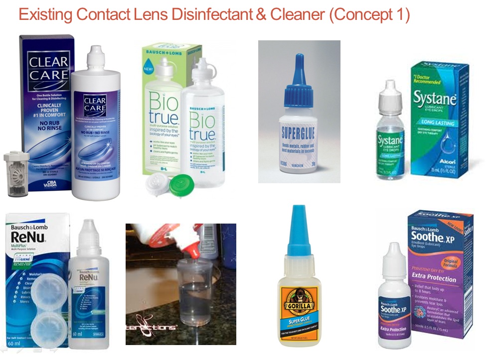
Problem:
1.) Contact lens cleaner look similar with eye drops, super glue, saline solution bottle, etc. At most cases, contact lens cleaner bottles are placed next to eye drops bottles on the same shelf at pharmacy stores. The recommended way of storing these similar looking products is the same, thus creates the danger of the low vision user choosing the wrong bottle.
2.) There have been many cases where people mistakenly used contact lens cleaner as eye drops, which causes severe eye pain, burns and chemical injuries. .
3.) The labels have failed to warn the consumers of dangers and precautions of using contact lens cleaner which contains 3% hydrogen peroxide that can cause burning/stinging sensation to the eyes.The information/words on the labels are small, disorganised, confusing, etc. The label design is too fancy and most of the spaces are reserved for branding.
4.) A lot of consumers are confused with the difference between contact lens disinfectant and contact lens rinse. Consumers are unaware that they need to use a special contact lens case (built-in neutraliser ring) to soak their lens for 6 hours for it to be fully neutralised, instead they use the conventional flat contact lens case to rinse or soak their lens for a few minutes or less than 6 hours.
5.) The nozzle of the bottle is not protected by any ribs/seals which can create contamination and allow the opportunity for bacteria to accumulate around the opening hole. Handling lens cleaner requires properly cleaned fingers.

Solution:
1.) Ergonomic curvature: Modified direction of the neck and nozzle allows the user to apply the drops at a more comfortable angle.
2.) The shape of the bottle acts a type of identification or signal for low vision user who may mistake it for super glue/eye drops bottle.
3.) Flat body surface for labeling. Improved labeling design for better understanding and aesthetics.
4.) textured neck for better grip
5.) Embossed lift tab: for fingers to lift the tab. No losing the cap.
6.) Raised nozzle seal protects the nozzle from bacteria and contamination.

Problem:
1.) Hard to open child-resistant packaging.
2.) Bad label design, too excessively decorated. Hard to read the information as the bottle shape is cylindrical.
3.) Some cap/covers are too large in terms of surface area, covers can be overly tightened.
4.) Most bottles look very similar with each other. Lack of visual cues and texture('touch to feel' features) for low vision users to identify different types of medication.
5.) Opportunity to lose the cap.6.) Narrow opening necessitates pouring pills.

Solution:
1.) Stout design for stability and confident look, slanted cover for easy access, openness and friendly gesture.
2.) The large surface area cover is fully coloured (one type of dramatic colour) so that the low vision user could easily identify the type of medication or container from far even though his or her vision is blurred.3.) Different types of textures are added onto the cover so that the user can feel the raised bumps by touching them to assist identification.
4.) The cover is to be slided. The cover will stay in place securely once the container is fully open. This means no losing the cap. Requires two finger action by holding onto two buttons at the same time to slide the cover upwards.
5.) The edge surrounding the button is curved for better comfort during the opening process.
6.) The container is semi-transparent so that users could see the content. Body surface is flat and mostly used for labeling.
7.) Easy to read and understand label. Delivers clear and only needed information.

Problem:
1.) Container shape looks very similar with other containers that contain different contents that serves different purpose. Exe: Moisturizer container looks like the arthritis cream container. The Himalayas tube looks like a toothpaste tube.
2.) Bad labeling design; too fancy.
3.) Bottle shapes looks very generic.
4.) Waste a lot of cream.
5.) Hard to squirt out the last few drops of cream from the tube.

Solution:
1.) Scientific looking bottle shape; looks hygienic and reliable. It's stance is confident.
2.) Uses dispensing mechanism to prevent wastage.
3.) Built-in wide angled cup that lifts up as the user rotates the cap anticlockwise for unlocking. User slides its finger around the cup to apply the cream onto its skin after pushing/pumping the surface area of the cup downwards. The cream will be excreted out slowly.
4.) The bottle can be locked after usage by rotating the cap clockwise.
5.) Improved labeling.
6.) Semi transparent bottle to reveal its content.
No comments:
Post a Comment