1.) http://dongkim926.blogspot.com/2011/10/project-2-upcycled-utility.html?showComment=1318912556964#c4396010327875733850
2.) http://ides1031alexanderjackson.blogspot.com/2011/10/upcycled-light-design.html?showComment=1318913164847#c693451420055350314
3.) http://ryan-go.blogspot.com/2011/10/upcycling-unwanteds-jellyfish-light.html?showComment=1318912334314#c1766933893381598733
4.) http://ides1031alexanderjackson.blogspot.com/2011/10/upcycled-light-design.html?showComment=1318913164847#c693451420055350314
5.) http://cf-indesign.blogspot.com/2011/10/project-2-upcycled-utility.html?showComment=1318912751278#c4733835511768981926
Monday, 17 October 2011
Project 2 : upcycled Utility
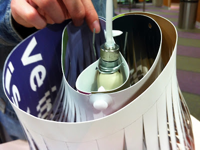
Paru-paru lamp is designed to embrace and make use of the natural physical properties that polypropylene can achieve. Paru-paru is made up of two separated rectangular sheets; one for the inner structure and the other for the outer structure. The inner structure of the lamp resembles a human lung which is called paru-paru in Malay and the outer structure is the body to protect the ‘lungs’. The aim of this project is to make an awareness of effects of smoking towards one’s health.
Both sheets have the same pattern of cut out perpendicular lines pointing outwards when the sheets are lying flat. The bigger sheet has a variation of widths of each strip which increases in size. This gives a different kind of texture, depth and pattern of the sheet especially when it is being curled. The overall shape of the lamp looks different when it is viewed from side to side. The front view has a curved shape bulging out in size starting from the ‘neck’ of the lamp. The arrangement of the pointy corners of the strips followed the flow of the folded sheet which curled outwards and then slightly inwards at the end. From the side view, the back of the lamp resembles the shape of a human’s backbone. On the other hand, the strips of the smaller sheet have the same width. This would help to contrast the overall pattern of both outer and inner structure of the lamp. The smaller sheet is folded in a different way compare to the bigger sheet. The two corners of the sheet are lapped on each other and locked onto the center of the edge to create a cylindrical space for the light bulb to fit in. The remaining edges are kept unclosed along the cylindrical shape for better ventilation and also helped to resemble the overall shape of a human lung. As a result, the arrangement of strips has a pleasing rhythmic flow which curves diagonally. This has also harmonised the overall visual elements of the lamp as the strips are agreeable with each other. However, some strips of the inner structure would overlap each other which give the sign that the lung is starting to deteriorating during smoking. The outer structure flopped downwards slightly as the top edges of the inner structure can be seen once hanged. This means that the smoker’s health will weaken during smoking.
Both sheets have different coloured but consistent printings. The outer structure has a colourful printing whereas the colours of the outer structure are a bit duller. Contrast of strength of light and colours are shown as the inner structure is white and outer structure is coloured on the outside. This feature actually shows that the smoker’s body feels alert but relaxed during smoking. When the lamp is switched on, the light is able to flow and shine throughout the inner area of the body. This indicates how fast the chemicals from the cigarette can be spread to all parts of the body. There is no wastage of material within the sheet as every part of the sheet will be used for the pendant lamp. Amount of clips and length of wire used is kept as minimal as possible so that the natural properties of the material itself can shine through without needing fasteners and wires to achieve the desired shape of the lamp.
Subscribe to:
Comments (Atom)


